
Session Frequency Chart for AI Model Usage
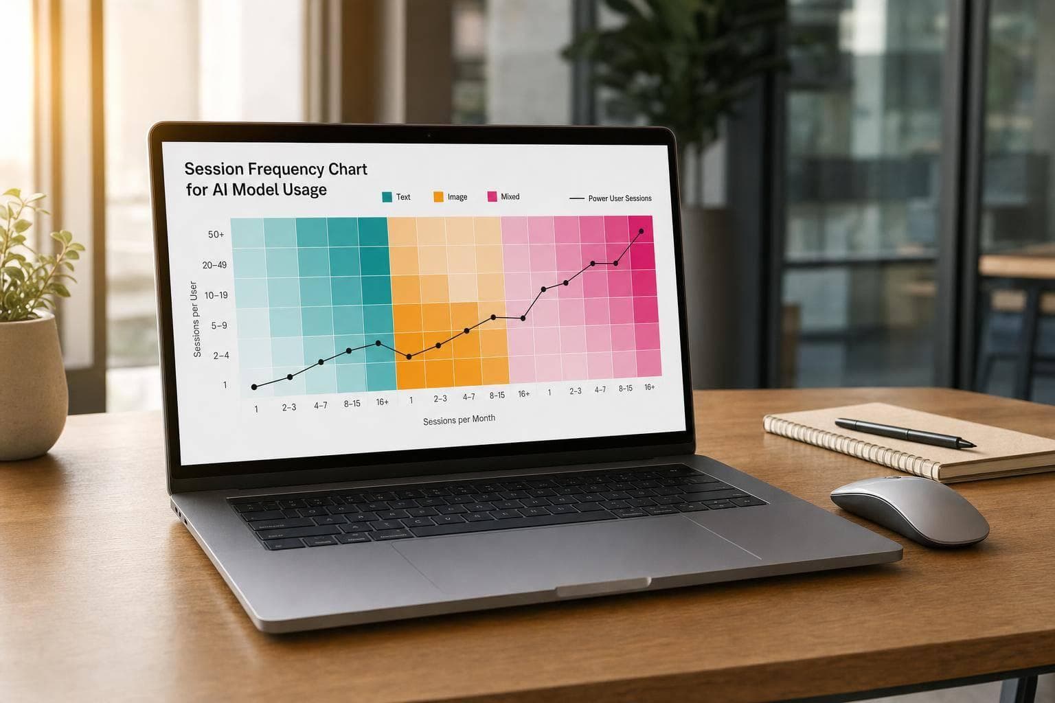
A session frequency chart shows one thing fast: who used your AI product once, who came back, and where usage starts to fall off.
If I were setting this up for 08/01/2026–08/31/2026, I’d keep it simple:
- Count sessions per user
- Group users into 1, 2–3, 4–7, and 8+ session buckets
- Split results into text, image, and mixed
- Compare bucket share, not just raw totals
- Watch for a bigger 1-session bucket and a smaller 8+ bucket across periods
That gives me a plain view of retention. If 55.0% of image users are in the 1-session bucket while text is 38.0%, I know image is where people are dropping off. If power-user share falls by 3–5 percentage points, that’s a warning sign.
A few setup rules matter most:
- Use a stable
user_id - Track
session_id, start time, and end time - Use one session rule, such as a 30-minute inactivity timeout
- Classify sessions by what happened in them, not just by model name
- Keep a small summary table under the chart for exact values
In short: I’d use this chart to find early churn, compare text vs. image behavior, and see whether repeat usage is getting better or worse month over month.
Pick the Right Data to Track Before Building the Chart
Before you build anything, start with a clean, minimal dataset. You don't need a giant table with every possible field. A small, steady set of fields is enough to build a session frequency chart you can trust.
Track User, Session, and Model Fields
At the user level, capture a stable, pseudonymous user_id. A hashed value or UUID works well. Don't use raw emails or phone numbers as the main identifier. If you want to compare behavior by account type, you can also add a plan field.
At the session level, record:
session_idsession_start_timesession_end_time
A 30-minute inactivity timeout is a common default for grouping events into one session.
At the model and event level, track the main model used in the session. Also count key actions, such as prompts submitted for text sessions and images generated for image sessions. Those counts help you read session depth instead of just session volume.
These fields give you the counts you need for the chart.
Separate Text, Image, and Mixed Sessions
Classify each session with a modality field: text, image, or mixed. Then classify each event with its own modality value: text or image.
At the session level, apply one timeout across all event types and use these rules:
- Text-only: at least one
text_prompt, noimage_generation - Image-only: at least one
image_generation, notext_prompt - Mixed: both in the same
session_id
Use event type, not just model name, to classify sessions. A Gemini session, for example, is still text-only if no image generation events happened during that session.
Once you've classified sessions, you can count them per user.
Calculate Per-User Session Counts for the Period
Filter sessions from 08/01/2026 to 08/31/2026, then group by user_id to count total, text, image, and mixed sessions per user. Use whole numbers with U.S. formatting, such as 1,234 sessions. For averages, use a decimal point, like 3.7 sessions/user. These per-user counts are the raw material for building frequency buckets in the next step.
Next, group users by visit count and plot the frequency chart.
sbb-itb-903b5f2
Build the Session Frequency Chart Step by Step
Group Users Into Visit-Count Buckets
Start by grouping users based on their per-user session counts, and stick with buckets as the term throughout. Use four buckets: 1, 2–3, 4–7, and 8+ sessions. These ranges keep the chart easy to read while still showing retention patterns.
Each bucket tells a different story. The 1 session bucket separates one-time or trial users, which helps you spot early drop-off. 2–3 sessions shows light returners who haven't formed a habit yet. 4–7 sessions points to users who are starting to come back with some regularity. And 8+ sessions highlights your power users.
You can assign users to buckets with a CASE WHEN rule in SQL, an IF formula in a spreadsheet, or a Python function. Keep both fields: the raw session count and the bucket label. You'll need them for the chart and the summary table.
Once the buckets are assigned, plot the distribution as a bar chart.
Plot and Label the Chart
Use a bar chart with session-count buckets on the x-axis and number of users on the y-axis. Each bar shows how many users fall into a given bucket, so the distribution is easy to scan.
Keep the chart centered on user distribution, not raw event volume. A few design choices make a big difference:
- Start the y-axis at zero so bar height isn't misleading.
- Label the axes Session Count Bucket and Number of Users.
- Use a title in U.S. month-year format, such as Session Frequency, Aug 2026.
- Format y-axis tick marks with thousands separators.
- Add short notes for key takeaways, like the share of users in a bucket.
- Use direct labels instead of a legend.
Add a Summary Table Below the Chart
The chart gives you the shape of the distribution. The table gives you the exact numbers. Place a summary table right below the chart so stakeholders can check what each bar stands for. Include five columns: Bucket, User Count, Share of Total Users, Avg Text Sessions, and Avg Image Sessions.
Calculate Share of Total Users as (bucket user count ÷ total users) × 100, rounded to one decimal place. For each average, divide total text or image sessions in the bucket by the bucket's user count.
| Bucket | User Count | Share of Total Users | Avg Text Sessions | Avg Image Sessions |
|---|---|---|---|---|
| 1 session | [Value] | [%] | [Avg] | [Avg] |
| 2–3 sessions | [Value] | [%] | [Avg] | [Avg] |
| 4–7 sessions | [Value] | [%] | [Avg] | [Avg] |
| 8+ sessions | [Value] | [%] | [Avg] | [Avg] |
This table adds the exact values the chart can't show at a glance. It also helps you see where users are concentrated by frequency bucket and whether certain segments lean more toward text or image sessions.
Compare Text and Image Sessions and Group Users by Frequency
Build Separate Charts for Text and Image Usage
Start with the overall frequency table, then split users into two views: one for users with text_session_count > 0 and one for users with image_session_count > 0.
From there, reuse the same frequency buckets for both views and plot them as side-by-side bar charts. This makes the gap between text and image behavior much easier to read. If one chart has a much larger 1-session bar, that usually points to weaker repeat use in that flow. In plain English: users tried it once, then didn’t come back. That’s a retention gap worth digging into.
Name the charts clearly:
- Text Sessions – Frequency Distribution
- Image Sessions – Frequency Distribution
Add data labels with the exact percentage on each bar so someone can scan the charts and get the point in a few seconds.
Group Users Into One-Time, Light, Regular, and Power Segments
Once the text and image split is done, group the same users into engagement segments based on total session count for the time period.
Assign each user one of these segment labels:
- One-Time
- Light
- Regular
- Power
Then add a mix label based on session type share. Mark a user as mostly text if 70% or more of their sessions are text. Mark a user as mostly image if 70% or more of their sessions are image. If neither type hits that cutoff, label the user as balanced.
This gives you two layers at once: how often someone uses the product, and what kind of use they lean toward.
Use a Comparison Table to Show Segment Differences
Put the segment results into one comparison table. The goal is simple: show which groups are fading and which ones still look healthy.
Give each segment its own row and include the metrics that matter most:
- average sessions per user
- share of total users
- recency in days, measured as average days since last session
- session mix
| Segment | Avg Sessions | Share of Users | Recency (Days) | Session Mix |
|---|---|---|---|---|
| One-Time | [Value] | [%] | [Value] | [Mix] |
| Light | [Value] | [%] | [Value] | [Mix] |
| Regular | [Value] | [%] | [Value] | [Mix] |
| Power | [Value] | [%] | [Value] | [Mix] |
Recency is the part to watch closely. If a segment has low session volume and high average days since last use, that group may be slipping away and may need reactivation. If recency stays low, users in that segment are still active now, not just historically.
Find Drop-Offs and Learn the Key Chart Reading Rules
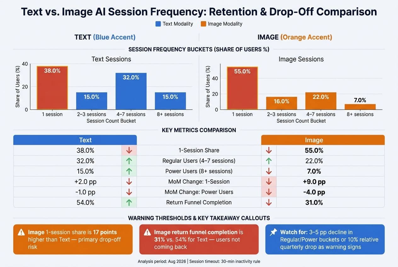
Text vs. Image AI Session Frequency: Retention & Drop-Off Comparison
Spot Drop-Offs Across Periods and by Workflow
After you bucket users and separate text from image usage, compare month-over-month share, not raw totals. That keeps the pattern easy to read even when overall volume goes up or down.
A rising 1-session share paired with shrinking 4–7 and 8+ shares points to drop-off. Treat a 3–5 percentage point decline in regular or power buckets, or a 10% relative quarterly decline, as a warning sign. If the 1-session bucket grows while the 8+ bucket shrinks, you're losing your most engaged users and adding more one-time users at the same time.
Link Drop-Offs to Text or Image Workflows
If the overall chart starts to move, split those same buckets by text and image to find the source. Use the same date range for both charts. If text stays steady but image shows a rising 1-session share, the problem sits inside image workflows, not across the whole platform.
A simple three-step funnel can help confirm that:
- User starts a session and selects a model
- User completes at least one generation
- User returns for a second session within the same analysis window
If image users get through step 2 but keep failing to come back for step 3, the issue is probably about perceived value or lack of guidance, not basic usability.
If mixed sessions have a higher 1-session share than either text or image on its own, the friction may come from switching between modalities.
Use a compact comparison table to isolate the weak spot:
| Modality | 1-Session Share (%) | Regular Users 4–7 (%) | Power Users 8+ (%) | MoM Change 1-Session (pp) | MoM Change Power (pp) | Return Funnel Completion (%) |
|---|---|---|---|---|---|---|
| Text | 38.0 | 32.0 | 15.0 | +2.0 | -1.0 | 54.0 |
| Image | 55.0 | 22.0 | 7.0 | +9.0 | -4.0 | 31.0 |
In this example, image workflows are clearly the issue. The 1-session share is 17 points higher than text, power users are at less than half the text rate, and return funnel completion is 31.0% versus 54.0% for text. That's where to focus first, whether that means better default image styles, prompt presets, or clearer model choices in the UI.
Conclusion: The Key Rules for Reading Session Frequency Charts
A few rules make session frequency charts worth using. Compare at least two consecutive periods so you're reading trends, not snapshots. Split the overall chart by text and image so you can trace any shift back to the right workflow. Watch for a rising 1-session share and a shrinking 8+ share across more than one period. That's an early warning that something is slipping in onboarding, in one workflow, or in the value users get from their sessions. The whole point is to catch that early.
FAQs
How should I handle users with multiple devices or logins?
Track engagement with local, privacy-first data storage instead of centralized account IDs. In NanoGPT, each device stores its own session history.
To keep usage frequency accurate, merge those local metrics in your analytics pipeline with metadata tags like user IDs or project IDs. That gives you one clear view of activity while sensitive data stays in the user’s hands.
When should I change the session bucket ranges?
Change your session bucket ranges when readability starts to slip or when long-term trends move in a new direction. For example, if your reporting window goes past 90 days, switch from daily buckets to monthly ones.
You should also update ranges, tracking parameters, and user segments when you notice major metric swings, odd spikes, or usage changes that call for either a closer look or a broader lens.
What’s the best way to investigate a rising 1-session share?
Segment these users first. The goal is simple: figure out whether they’re just kicking the tires or hitting a wall when it’s time to use the product in day-to-day work.
Look at acquisition source, device type, and account type. If the pattern shows up mostly in one slice, that gives you a strong clue. For example, users from one campaign may have signed up with the wrong expectations. Mobile users may be running into UX issues. A certain account tier may not be getting enough setup help.
Then dig into how they move through the product. Review interaction paths, completion rates, and error events to spot where people fall off. You’re trying to find the exact moment where interest turns into hesitation, confusion, or abandonment.
It also helps to compare this group with power users. That side-by-side view can show what successful adoption looks like and where this group starts to drift. Maybe power users complete setup in one session, while this segment stalls on a key step. Maybe they use the same feature set at first, then stop after one failed action.
If the increase started right after a feature launch, add timing into the analysis. In some cases, a spike like this is just short-term curiosity. People click around, test the new thing, and leave. In other cases, the pattern sticks, which usually points to friction that’s blocking regular use.